Categories
Design tips Integrations New Features News

Amaze Teams Up with Adobe Express to Transform Creator Commerce

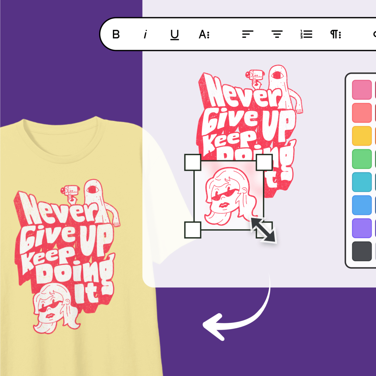
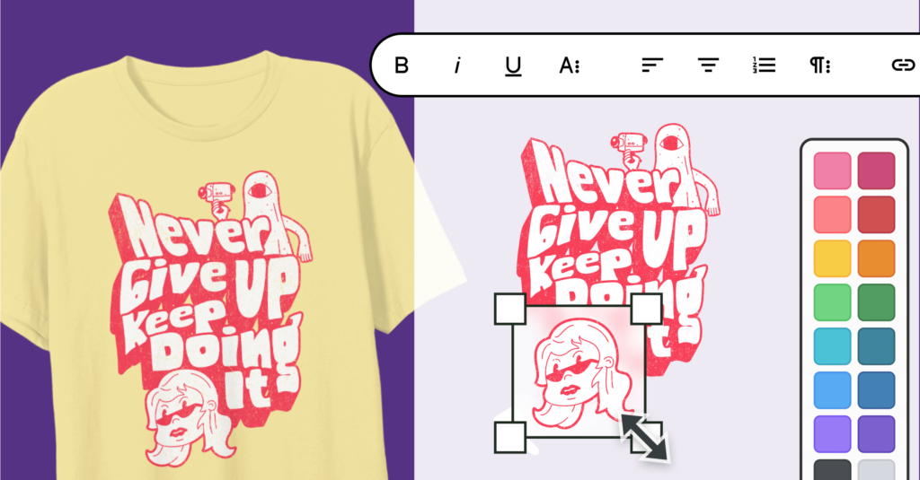
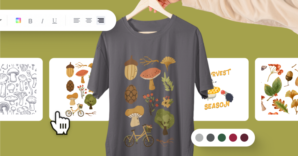
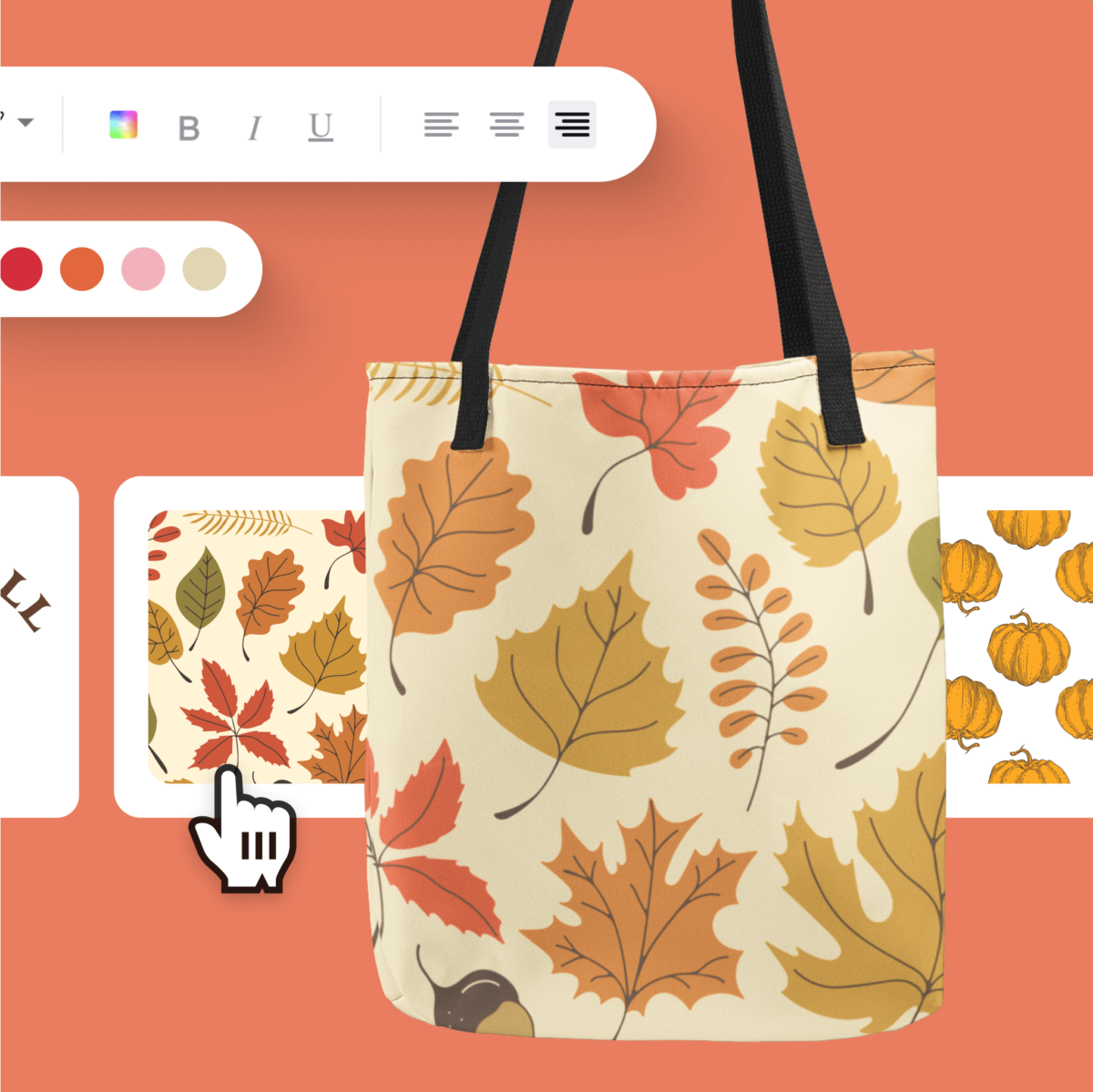
CALIFORNIA, October 14, 2024 – Amaze, a leader in creator-powered commerce solutions, announced today a strategic integration with Adobe Express, the quick and easy create-anything app, to put Adobe’s world-class creative tools right at the fingertips of creators directly on the Spring by Amaze platform. This integration is a game-changer, providing creators of all sizes with seamless access to professional-grade design features—directly within Spring—making it easier than ever to create and sell extraordinary products.

A New Era of Seamless Creator Commerce

Starting today, Adobe Express will be integrated into Spring, allowing creators to design stunning graphics, apply them to products, and launch within one seamless platform—simplifying the entire process from idea to market. Creators can now elevate their products from great to extraordinary with the intuitive design tools Adobe Express is known for.

This integration couldn’t come at a better time as the creator commerce landscape rapidly expands. According to Pew Research Center, creators are in a prime position to capitalize on their influence, with three in ten adult social media users reporting they’ve purchased something after seeing a post from an influencer or content creator. However, most of these purchases are for products made by other brands, meaning creators only earn a fraction of the profit through affiliate marketing or promotions. By launching and selling their own products, creators can unlock a more lucrative revenue stream, earning more from each sale while also strengthening their brand.

The challenge for many creators has been navigating the complexities of design, product development, and logistics, leading to missed opportunities. That’s where this collaboration comes in. With Spring handling all printing, shipping, manufacturing, and distribution aspects, creators only need to focus on designing and promoting their products. Now, with the power of Adobe Express integrated into Spring, designing products their communities will love is easier than ever. The entire process—from concept to launching a live product—can be completed in minutes, all within the Spring platform. This integration is making it simpler than ever for creators to bring their ideas to life and start selling quickly.

Simplifying Design, Amplifying Creator Success

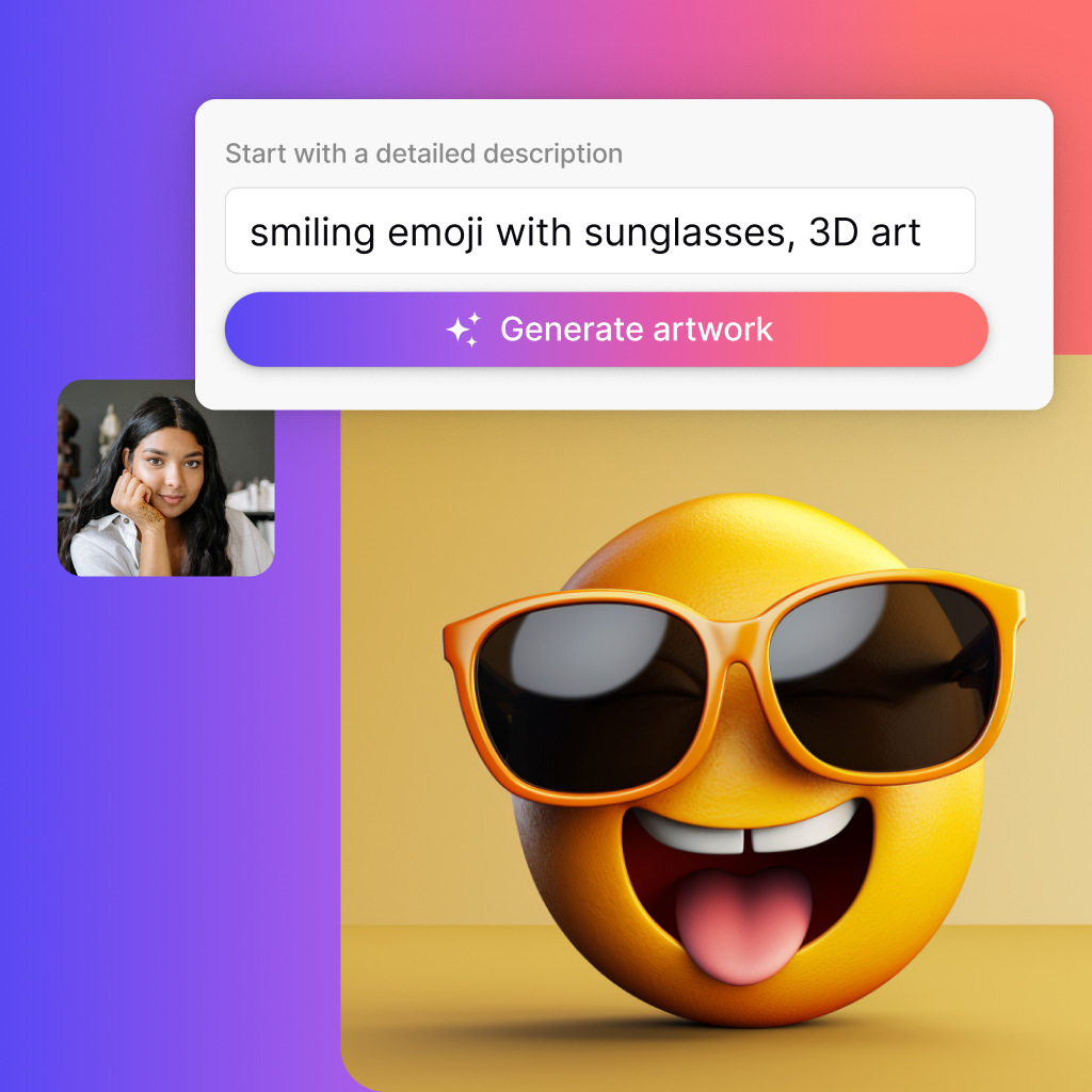
Adobe Express brings more than just design capabilities—it brings a new level of creative freedom. With features powered by generative AI designed to be safe for commercial use, creators can effortlessly transform simple text prompts into eye-catching, professional-grade graphics in just a few clicks. This powerful blend of ease and functionality means that even those with little to no design experience can produce stunning visuals their online communities will love. With access to thousands of professionally designed templates, a vast library of Adobe assets, and powerful editing tools, creators can streamline the design process while creating a distinctive look.

“Our goal at Amaze has always been to empower creators by removing barriers to success,” says Aaron Day, CEO of Amaze. “This collaboration with Adobe Express is a natural extension of that mission. By integrating Adobe’s design tools directly into Spring, we’re giving creators everything they need to succeed—all in one place. We believe that when creators have the right tools, they can turn their vision into reality, and, in doing so, unlock new revenue streams and build thriving businesses.”

Key Features of the Amaze and Adobe Express Integration:

  • Intuitive Design Tools: Professional-grade design tools are now available directly within the Spring product launcher, making it easy for creators to design graphics for their products without ever leaving the platform.
  • Generative AI Capabilities: Advanced AI features allow creators to transform simple text prompts into stunning visuals and unique text effects, streamlining the design process. Adobe Express features powered by Adobe Firefly generative AI are built to be commercially safe so creators can confidently use them for their businesses.
  • Vast Creative Library: Creators can access Adobe’s extensive collection of fonts, templates, and images to elevate product designs and create professional-quality products.
  • Exclusive Offer for Spring Creators: Spring users can take advantage of a 3-month free trial of Adobe Express Premium, unlocking even more advanced design features and creative possibilities.

Building the Future of Creator Commerce

Adobe’s mission has always been to make creativity accessible to everyone, and this integration with Amaze is a testament to that commitment. “We’re excited to partner with Amaze and bring the power of Adobe Express to the creator economy,” says Rob Cohee, Director of Product Management at Adobe. “By integrating directly into Spring, we’re giving creators the tools they need to create high-quality products that resonate with their audience—and turn those products into real business success.”

Amaze is not just leading the charge in creator commerce—it’s breaking down walls that once held creators back and opening doors to new possibilities. The path to building a brand, growing a community, and achieving financial freedom is now a reality for every creator. With the tools and support Amaze provides, there are no limits to what creators can achieve.

For more information about the Spring Adobe Express integration, please contact:

Marie Moore for Amaze

917-375-4790

marie@contendco.com

About Amaze

Amaze Software, Inc. is an all-in-one, end-to-end commerce solution for any creator looking to generate sustainable monetization and depth of community connection. Our creator-powered commerce solutions include a product creation platform, advanced commerce tools, and scalable managed services that help anyone sell anything, anywhere. We believe anyone can be a creator and that everyone should be empowered to tell their unique story, cultivate deeper connections with their audience, and create authentic, shoppable experiences that allow them to monetize their passion.

We’re on a mission to unleash potential and make it easy to create, share, and sell products and services. Build a no-code web page at www.amaze.co or launch a free store at www.springforcreators.com. For press inquiries, please email info@amaze.co.
Categories
Design tips Holiday Season

2024 Holiday Lookbook: Product Design Inspo 

In a world where sometimes it can feel like doom & gloom in the media, isn’t it wonderful that the holidays are upon us and we can look forward to a festive season with our communities and loved ones? 

That’s right, Spring creators. Dust off those design ideas floating in your head and put that holiday touch on them. It’s time for some North Pole inspo to get your products holiday-ready for 2024! 

Here are 8 trending Holiday themes and color trends to inspire you. Hop on these trends to create new designs, experiment with new color palettes, and create themed holiday posts on your socials! Let’s get going so you can sleigh the holidays (still love that term).

8 Holiday Themes and Color Schemes for 2024

1. Have a Blue Christmas

Go for a chill Christmas with the icicle vibe of blue trees and a calming blue color palette. Blue delivers a contemplative feel, just what some are looking for during the holiday season. Shades of blue consistently rank as everyone’s favorite color, most likely due to its calming effect on the brain. But know what else is cool? Blue can work for a variety of Holiday designs, especially when tying in wintry themes. 

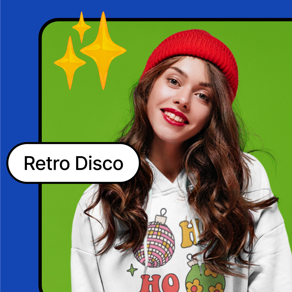
2. Retro Disco: Become an X-Mas Dancin’ Queen 

    Disco balls. Platform shoes. Bright pinks! Go loud and proud, baby! 2024 might as well be 1974! 

    One of the most playful Christmas trends happening is disco balls—as wreaths, hanging from the ceiling, on the tree, on a tee, you name it. And don’t expect to just see silver, but in every color, especially the hot pinks. 

    Expect to see disco everything: disco wine coolers, disco lips, disco mushrooms, analogue radios, tassels, fringes, platform boots and more! It’s time to boogie on down this Christmas! 

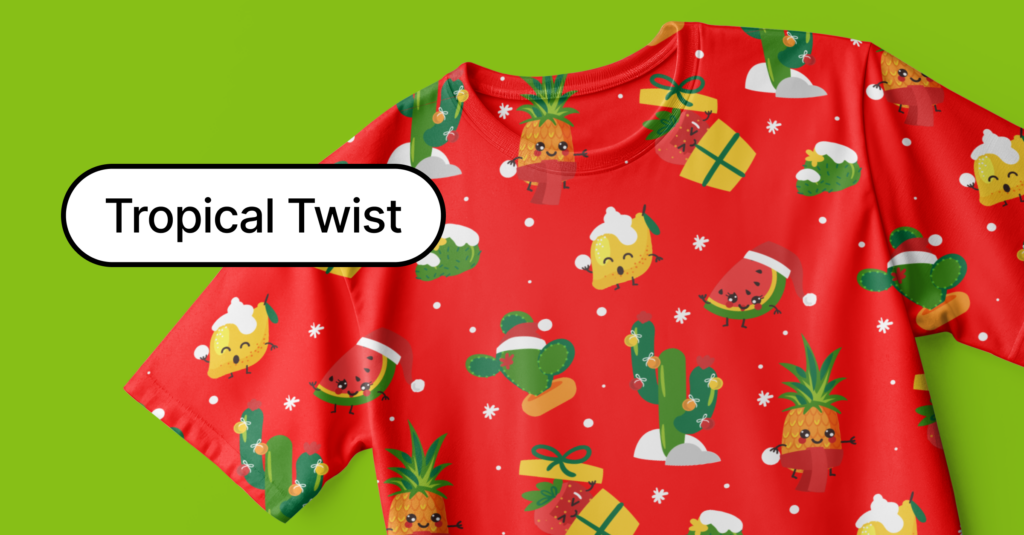
    3. Tropical Twist: Give Dad a “My Tie” 

      It’s time to kick tradition to the curb. Who says a Christmas tree has to be a Douglas Fir? Deck out a palm tree and add some cocktails and summer fun to christmas. And while you’re at it, throw some tropical designs on your tees and hoodies! 

      Since the trend is in, take it even further. Bring on the vibe with hummingbirds, butterflies, exotic animals like leopards and flamingos replacing the usual polar bears and robins. Add in all the tropical greenery you can muster. Splash the green palette with purples, pinks, and golds. Create a vibrant look that vibes like a holiday in paradise. Mele Kalikimaka! 

      4. Bows: Tie One On

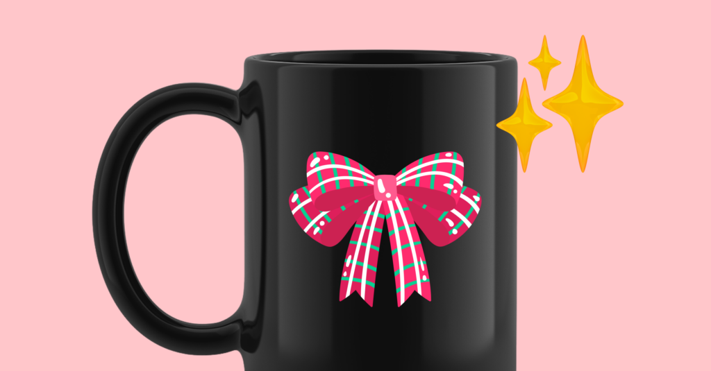
      Call it a holdover from Barbiecore 2023, but bows are still going strong. Large bows everywhere. Take pics of your bows, then slap the pic on your merch. Have fun with it. 

      This is one trend that isn’t going away anytime soon. Thank you Greta Gerwig!

      5. Whimsical Woodland: Nod to Nature

      We’re talking citrus accents, pine cones, and woodland creatures–they do holidays, too! 

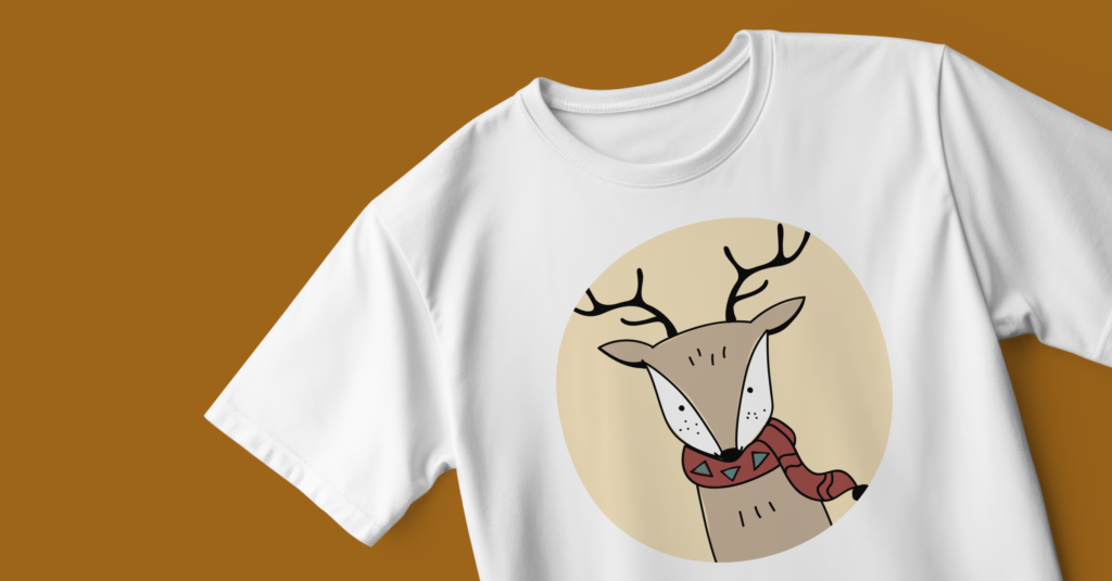
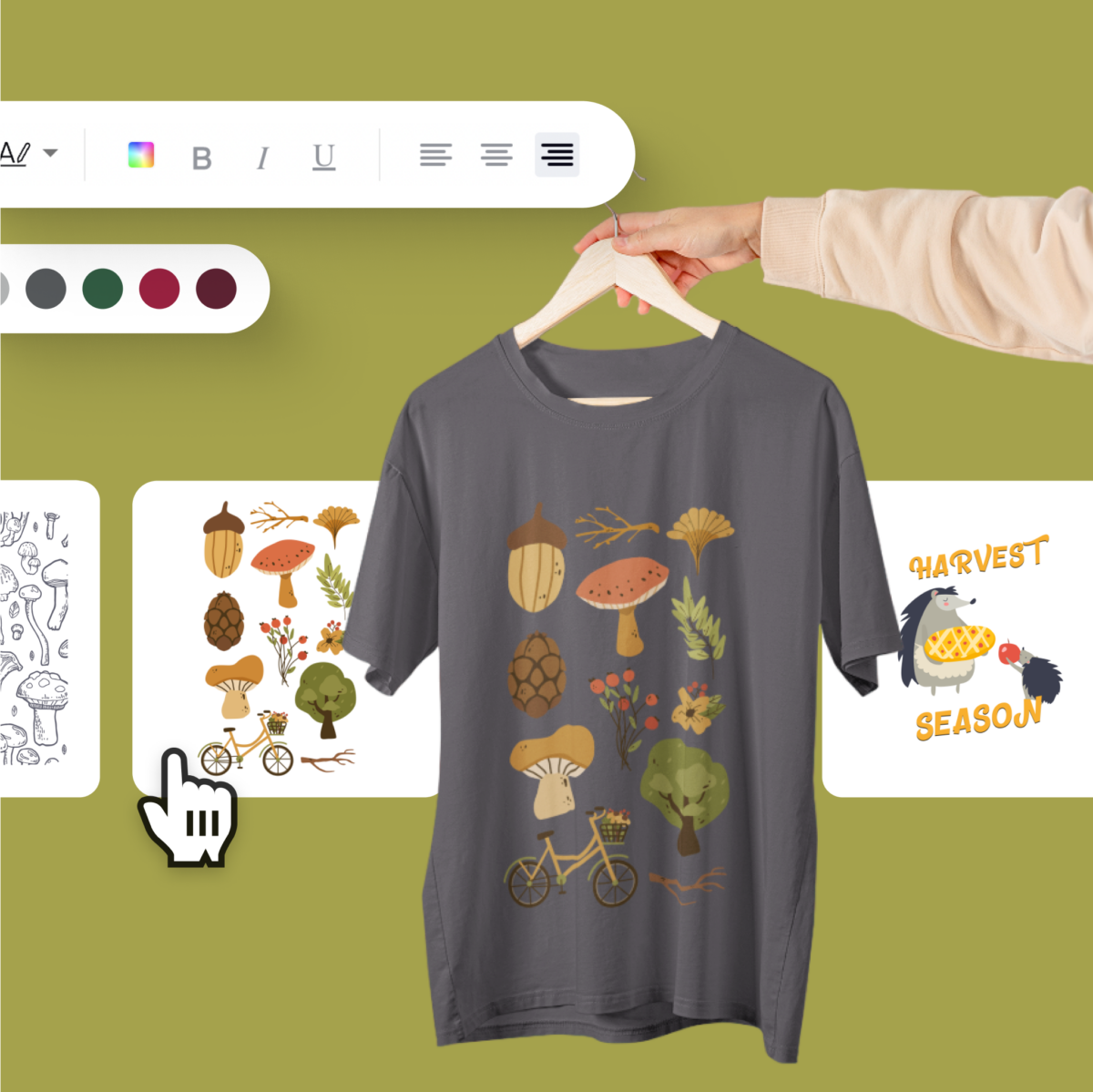
      The woodland vibe involves earthy tones of rust, terracotta, brown, and green to create a rich backdrop for a slew of forest creatures, both real and mythical. Bring the holiday to all creatures big and small as your squirrel friends, along with the hedgehogs, deer, and foxes, frolic through your design.

      Slap these magical woodland and mystical visitors (like gnomes hiding under their giant mushrooms) on your merch and watch your sales bloom like one of the petunias that just got sprinkled with some Holiday fairy dust. 

      CANDYLAND: Get a Sugar Rush 

      Whoever says Candyland shouldn’t be a thing has no soul. Ok, maybe they have a soul but not a sweet tooth. 

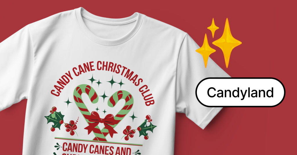
      Candyland decor just gets bigger and bolder every year. We’re talking a colorful palette of gingerbread, candy canes, cupcakes, macarons, and all that sugary goodness. Bring the sweets to your merch for a sweet holiday treat.

      7. Ice Ice Baby: Take the Polar Plunge

      Not feeling the tropical vibe? No worries. Haven’t you heard? Everyone’s going Polar. Time to take a walk in a winter wonderland. 

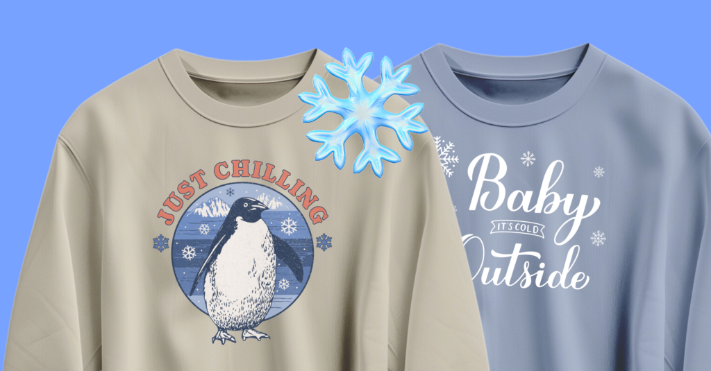
      This trend went out of style for a few years but is roaring back with a vengeance in 2024. Go big with the designs dripped in icicles, shiny glass, and crystals. Adorn your merch with ice skates, polar creatures and delicate snowflakes. Keep it chill!

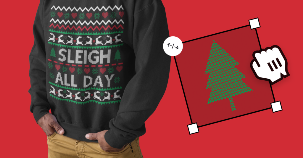
      8. Go Ugly: Everyone Wants an Ugly Christmas Sweater

      With one in three people grabbing an ugly Christmas sweater each year, it’s a must-have holiday product to launch this year. Go nuts and do your own thing. No rules!

      Want more tips?

      Get them along with more inspiration at our Holiday Resource Hub. Complete the tasks on our bingo card to enter a raffle where you can win $3000 and other incredible prizes! 

      Keep in mind that the earlier you get your designs done the earlier you can start promoting, especially for products that need to ship in time for the holidays…Capitalize on that holiday excitement and start creating those holiday designs! 

      Happy holidays and happy selling!

      Categories
      Creator success Design tips Launching products

      Unlock More Sales on Spring with These Product Design Tips

      Ready to create hot-selling products on Spring and work smarter, not harder? We’ve got you! 

      Below we get into the best practices and tools that can help you turn your creative ideas into real-life products that capture attention and drive sales.

      Level Up with Top Design Tools

      When you’re aiming to make your mark online, the design tools you choose can be game changers. Whether you’re setting up killer graphics for your Spring store or dropping eye-catching posts on social, having the right tools in your arsenal is crucial. From slick, easy-to-use apps for quick designs to professional-grade tools that won’t cost you a dime, here’s the lowdown on the top design tools that will help you create standout visuals in no time.

      Canva: Your Go-To Design Studio

      Canva is a goldmine for anyone looking to whip up designs quickly and efficiently. It’s stacked with free templates, photos, and graphics—perfect for creating everything from t-shirt designs to promotional graphics without breaking a sweat.

      Photopea: Like Photoshop, but Free

      If you’re into Adobe Photoshop but not the price, Photopea is your new best friend. It offers many of the same features for free, making it a solid pick for detailed editing and complex designs.

      CorelVECTOR: Design on the Go

      Whether you’re at a café or on your couch, CorelVECTOR lets you design from anywhere. It’s beginner-friendly and available on any device, making it super convenient for creatives who are always on the move.

      Not enough options? Check out more design resources here.

      Master the Art of Mockups to Perfect Your Designs

      Getting your designs just right before they hit the market is crucial, and that’s where mockup tools come into play. They’re your best bet for ensuring your graphics look spot-on in real-life scenarios. 

      Whether you’re adjusting a tee design or previewing a new phone case, these mockup generators let you see your creations in the wild before making them public. Here’s a lineup of some stellar mockup tools that can help refine your designs, providing a sneak peek at how they’ll actually look and feel to your customers.

      Placeit: Visualize Before You Finalize

      Placeit lets you see your designs in real-world settings, which is super helpful for making sure they look just as good on a product as they do on your screen. It’s perfect for fine-tuning your creations before they go live.

      Mockup World: A Smorgasbord of Free Mockups

      For a wide variety of mockup options, Mockup World is the place to be. It’s free and offers high-quality mockups for virtually any product you can think of.

      Renderforest: Not Just Mockups

      Renderforest is about more than just placing your design on a tee or mug; it’s also great for building your brand with custom logos, animations, and videos.

      Mediamodifier: Quick, Realistic Mockups

      Mediamodifier is ideal for those last-minute checks to ensure your design fits perfectly in the intended product scene. It’s all about giving you a realistic preview fast.

      Design Smart: File Specs and Tips

      Creating awesome designs is just the first step; the real magic happens when they’re print-ready. Nailing the technical specs is crucial to ensuring your visuals look as crisp and vibrant in person as they do on your screen. 

      From choosing the right file formats and sizes to optimizing the resolution and color accuracy, here are the essential tips to keep your designs looking top-notch when printed. Whether you’re a seasoned designer or just starting out, these guidelines will help you master the art of file preparation for flawless results every time. You can also read our complete design requirements here.

      File Formats and Sizes

      Stick to high-quality PNG files to keep your visuals crisp and clear. Watch the file size—Spring has a 50 MB limit, so size your files accordingly.

      Resolution for Perfection

      For the sharpest details, aim for 300 DPI. If you’re working on larger designs, like for all-over prints, you might need to drop to 150 DPI to manage file sizes without losing quality.

      Color Accuracy

      Stick with CMYK for color accuracy in printing. Bright and neon colors might look cool on screen but can be tricky to print, so it’s best to avoid them.

      Share Your Designs Across Social Media

      Once you’ve nailed your designs, the next step is to get the word out and make some noise on social media. These savvy tools are here to supercharge your online presence, helping you extend your reach and showcase your latest creations. From creating killer graphics that highlight your new products to managing posts that keep your fans engaged, these apps make it easy to maintain a dynamic and attractive social feed. 

      Whether you’re looking to simplify your content creation process or amp up your engagement, here’s a rundown of the top tools that can help you level up your social media game effortlessly.

      Canva: Double Duty

      Not only great for design, Canva also comes through for your social media needs—schedule posts, create stunning graphics, and manage your content all in one spot.

      Lunacy: AI-Driven Design Freedom

      Lunacy offers AI tools that help speed up the design process, plus tons of free resources like icons and photos—perfect for making your social feeds look professional with minimal effort.

      Adobe Express: Quick Hits for Social Media

      Adobe Express is your quick-fix tool for engaging social content. Whip up posts and videos in minutes with a suite of easy-to-use templates.

      CapCut: Simplified Video Editing

      CapCut is the hero for anyone who wants to edit videos without a fuss. It’s packed with cool features that make video editing straightforward and fun.

      Splice: Mobile Video Editing Magic

      Splice turns your smartphone into a mini editing suite, ideal for creating top-notch videos right from your phone. It’s user-friendly and perfect for boosting your video content game.

      Wrap-Up

      With these tools and tips, you’re all set to make your Spring store a standout success. It’s all about blending creativity with smart design practices to create products that not only catch the eye but also capture the market. So gear up, get creative, and start designing!

      Categories
      Creator success Design tips Launching products Promoting merch

      7 Ways to Earn More Money on Spring

      Spring makes it easy for you to create products and make money selling them. However, many of our users struggle to make even one sale. If that’s you, or you believe you’re not getting as many sales as you should, don’t sweat it! Check out the steps below to learn the secrets to creating and selling like a boss on Spring!

      1. Design Graphics Tailored to Your Following

      Your fans are your biggest supporters–and who you’re selling your products too,–so make them the inspiration behind your designs. Center your creations around those special moments from your content that your fans know and love—the funny jokes, the memorable quotes, or even your beloved sidekick, like your pet. Let your designs reflect the vibe of your community, with a playful touch that only your true fans will appreciate.

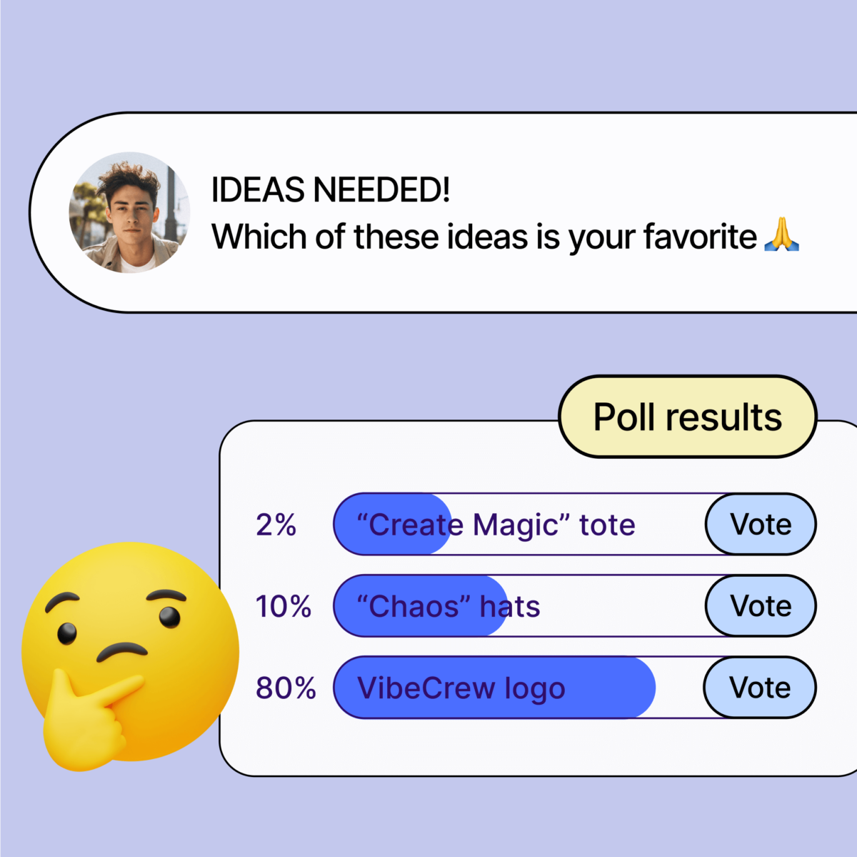
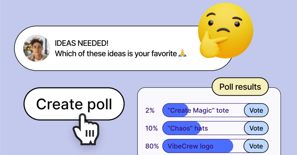
      If you’re stuck on what to make, take advantage of your social media fam by running polls or surveys to get their input directly. Find out what designs they’re vibing with, what gets them excited, and let their feedback guide your creative process.

      And if you’re looking for some extra design mojo, dive into the world of AI design tools. Check out these three free platforms:

      Canva: 

      Canva is a great beginner tool with an easy interface that makes designing images and text easy to do. It also offers a new AI feature where you can request specific images to be created for you.

      Pixlr: 

      Whether you’re a newbie or a pro, Pixlr’s AI-powered tools have got you covered. From basic edits to cool effects that’ll make your designs pop, Pixlr makes it easy to bring your vision to life.

      Gravit Designer: 

      Try vector design with Gravit Designer’s intuitive features and AI-driven capabilities. With powerful tools at your fingertips, you’ll be creating captivating designs in no time.

      With these tools in your arsenal, you’ll be whipping up designs that speak directly to your audience, paving the way for a merch launch that’s as unique as you are.

      2. Pick the Perfect Products

      When it comes to choosing products for your designs, think about what your fans would actually want to snag. If you’re a gaming creator, consider slapping your designs on desk mats, phone cases, and other cool tech gear. Or, if you’re more into the fitness scene, try leggings, sports bras, or water bottles. You want to make sure you cater to your audience’s interests.

      You’ll also want to keep the seasons in mind. When the chilly weather rolls around, cozy hoodies and long sleeves are a must-have. But when the sun’s shining, tank tops and board shorts are where it’s at. 

      Need some inspo? Check out all our hot sellers right here.

      3. Keep the Launch Party Going

      Spring gives you the green light to launch as many products as your heart desires. Why? So you can experiment, of course! Test out different designs and product types to see what gets your followers buzzing. And hey, if something doesn’t quite hit the mark, no sweat—you can easily unlist it and move on to the next big thing.

      But here’s where the magic happens: Take note of what works and what doesn’t. What designs have your fans raving? What products are flying off the shelves? Use that golden info to fine-tune your strategy for future launches and keep the good vibes rolling.

      4. Highlight Your Hottest Hits

      Give your best sellers the spotlight they deserve and make them easier for your fans to find on your storefront.

      Here’s how to place products at the front of your store:

      1. Click on Stores on the left-hand menu.
      2. Select Edit Store
      3. Click Products
      4. From there, you can star any products you want to feature at the top of your store. 

      5. Order Samples and Use Them in Your Content

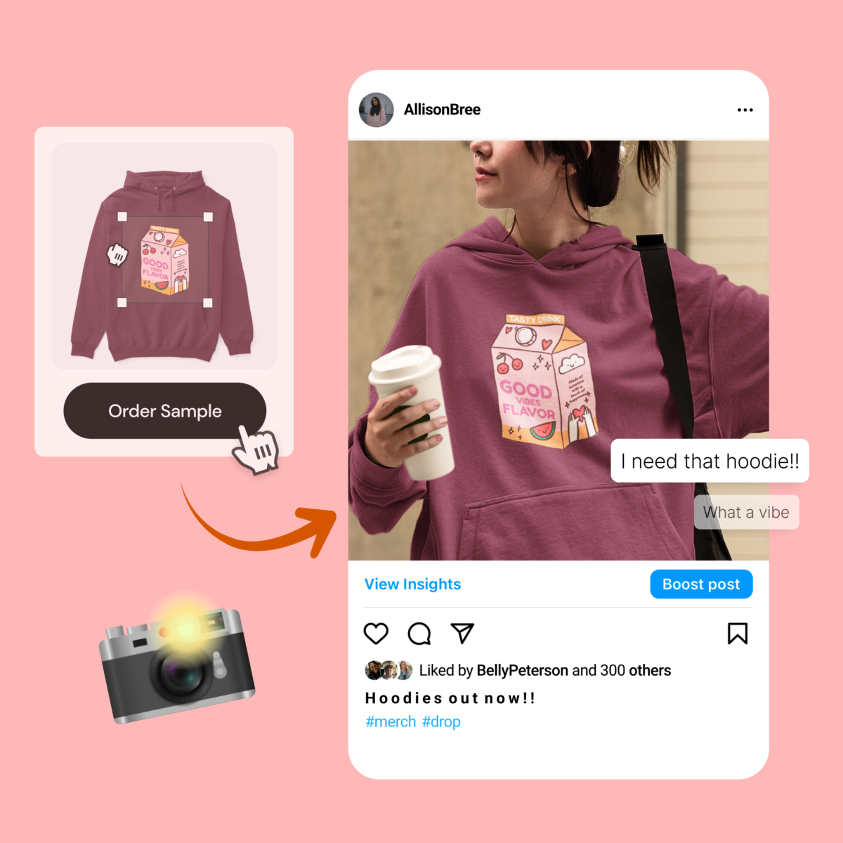
      Using samples in your content can increase your sales by 300%! So get your hands on some samples of your products and incorporate them into your content strategy. Whether it’s unboxing videos, photoshoots, or giveaways, showing off your products in action can drive interest and sales. 

      You can order samples here!

      6. Spread the Word on Social Media

      Once you have your designs and products live, it’s time to turn up the volume on your socials and get the word out about your awesome merch! Hit up all the platforms where your fans hang out and start showing off your awesome products.

      Whip up some eye-catching social graphics and videos that showcase your products in all their glory. Talk ’em up, show ’em off—whatever it takes to get your fans excited to hit that “add to cart” button.

      Also, don’t forget to drop your store link in your bio to make shopping for your products easy, as well as add our social integrations

      7. Reach Out with Email Campaigns

      Email campaigns are a great way to boost sales and keep your fans engaged/aware of your new drops.

      If you have an email list, use it to share exciting updates about your latest merch drops, exclusive deals, or behind-the-scenes peeks into your creative process. With the right message, you’ll have ’em hitting that “buy now” button in no time.

      If you don’t have access to an email list, but have gotten a lot of sales, reach out to us at creatorsupport@spri.ng. We’ve got your back, and we’re here to help you make magic happen.

      Now Go Start Earning!

      Our platform is designed to help you earn with ease, and with these tips in mind, you can become unstoppable! 

      Follow us on Instagram, Facebook, or Twitter for weekly tips and tricks on how to succeed on Spring! 

      Categories
      Creator success Design tips

      How To Turn Viral Moments Into Hot-Selling Merch

      Going viral is one of the best things that can happen to content creators. Not only does it boost your followers and make you internet-famous, but it can also fill your wallet—especially if you know how to turn that moment into awesome merch.

      So, if you have content that blew up or got tons of likes and shares, don’t let it slip away! Take that moment, turn it into a killer design, and slap it on merch to sell to your fans.

      When done right, viral moments translated into designs can deeply resonate with your audience and ignite excitement for them to purchase. Plus, it’s a cool way for them to show off their fandom to their buddies who love your stuff too.

      Ready to turn your viral moment into a merch empire? Check out our tips below and let’s make some merch magic happen! 

      1. Strike While It’s Hot:


      Timing is key when it comes to cashing in on a viral moment. Don’t hesitate—start brainstorming merch ideas as soon as your video starts blowing up.

      If you’re feeling stuck on what to create, consider these things:

      • Was there a line in your content that had everyone laughing or quoting it in the comments? This could be a good line to throw on some merch.
      • Could any freeze frame from your video be turned into a funny meme?
      • What are people chatting about in the comments? Is there a theme that keeps popping up?

      By asking these questions, you’ll get a good idea of what kind of merch would really hit home with your fans.

      For instance, let’s say your viral moment captured you busting a move with your grandpa, and everyone in the comments couldn’t get enough of his smooth moves. You could turn that into a meme with him rocking digital sunglasses and the caption “I leave no crumbs.” Then, slap that meme on coffee mugs, shirts, notebooks—whatever you think your audience would love.

      But remember, don’t spend ages agonizing over the perfect design. The quicker you act, the more impact your merch will have.

      2. Keep It On-Brand:

      When creating your merch design, it’s important to keep it on-brand and give it the familiar vibes that people already associate with you and your content. So whether it’s a hilarious catchphrase, a jaw-dropping discovery, or a signature move that got everyone hyped, your design should still resonate with your brand. 

      Why? Here are a few reasons staying on brand is so important:

      Brand Recognition 

      Keeping your merch consistent with your brand helps your fans instantly know it’s yours. When they see your merch, they should be like, “Oh yeah, that’s [Your Name]’s stuff!” It makes them more likely to buy it and rep it proudly and allows them to easily bond with other fans of yours when they’re out and about.

      Emotional Connection

      You’ve built up a real bond with your audience over time, right? Your brand represents all the things they love about you—your humor, your positivity, your unique perspective. So when your merch reflects that, it strengthens the connection even more. 

      Making It All Fit

      Your merch should feel like it’s part of the bigger picture of you and your content. Whether your fans are watching your videos, scrolling through your socials, or rocking your merch, everything should feel like it’s from the same awesome universe. When it’s all consistent, it creates this super cool experience for your fans that they can’t get enough of.

      With that in mind, here are some tips to help you stay on brand as you transform your viral moment into a design your fans will instantly recognize as yours:

      • Think about what makes your brand unique and incorporate those vibes into your merch designs. Whether you’re all about humor, positivity, or breaking boundaries, try to add some of that into your viral moment merch design.
      • Keep your design in line with your overall aesthetic. Whether you’re into bold and colorful or chill and minimalist, translate your viral moment into your style.
      • Don’t forget to use your existing brand elements, like logos and colors, if it makes sense, to tie everything together and make your merch instantly recognizable.

      3. Get Creative with Products:

      Choosing the right products for your merch is key to turning your viral moment into a cash cow! 

      Here’s how to pick products that will have your fans lining up to buy:

      Know Your Audience

      Consider what your fans are into and choose products that match their style. Whether they’re gamers, fitness freaks, or everyday parents, pick merch items that they’ll actually want to buy and use. If you’re not sure which to choose, browse our Core Collections for ideas.

      Think Outside the Box

      Don’t stick to the basics—get creative with your merch ideas! From socks to pet tees, explore unique products that stand out and make a statement. 

      Stay Practical

      While being creative is important, make sure your merch is also practical and useful. Choose items that people can use in their daily lives, like water bottles or tote bags, to ensure maximum exposure for your brand. Also, coffee mugs are one of the best sellers and easy gift ideas, so consider adding your viral moment to one!

      Test and Learn

      Don’t be afraid to experiment with different products and see what resonates with your audience. Gather feedback and use it to refine your merch lineup over time, ensuring that you’re always offering what your fans want.

      4. Get Your Fans Involved:

      Your fans are the heart and soul of your content, so why not make them an integral part of your merch-making journey? Start by sharing sneak peeks of your designs on social media platforms like Instagram, Twitter, and TikTok. Let them see the creative process unfold in real-time and give them a glimpse behind the scenes.

      But don’t stop there—ask for their input and feedback! Run polls or contests to let them vote on their favorite designs, colors, or slogans. Not only does this make your fans feel valued and appreciated, but it also gives them a sense of ownership over the final product. And when your fans feel like they’ve had a hand in creating your merch, they’ll be even more excited to rock it and show it off to the world.

      5. Shout It from the Rooftops

      Last but not least, once your merch is live, go all out spreading the news! 

      Here are some of the best ways to do that: 

      Blast it on Social Media

      Your social media platforms are your megaphone, so use them to their full potential! Post about your merch on Instagram, Twitter, TikTok, and any other platforms where your fans hang out. Remind everyone of your viral moment and why you created this merch.

      Order Samples

      Samples can increase your sales by 300%, so don’t be afraid to order yours! Once you have your samples in hand, you can use them in your content and advertise them without even saying a word about it! Fans that see you wearing or using products that remind them of your viral moment will be intrigued and want to get their hands on them. After all, you’re internet famous, so who doesn’t want to copy you?

      Host Giveaways or Contests

      Everyone loves free stuff, so why not host a giveaway or contest to drum up excitement for your merch launch? Offer prizes like exclusive merch bundles, signed merch items, or even a virtual hangout with you. Encourage your fans to participate by sharing your merch launch posts, tagging their friends, or creating user-generated content related to your merch. Giveaways and contests are a fun and interactive way to engage your fans and generate buzz around your merch launch.

      Create FOMO

      Use scarcity and limited-time offers to create a sense of urgency and encourage your fans to act fast. After all, your viral moment will probably only have a short time under the sun, so creating FOMO around your merch is a good plan no matter what.  

      Engage with Your Fans

      Don’t forget to keep the party going with your fans during your merch launch! Reply to their comments and messages, give them a big thanks for all the love, and make sure they feel like they’re in on the action. Encourage them to show off their new merch on social media, especially because so many people will have seen your viral moment. Building that sense of community and connection with your fans will make your merch launch even more successful!

      What’s next?

      In the end, turning your viral moments into hot-selling merch is not just about capitalizing on a trend—it’s about building an epic connection with your fans. By getting creative, sticking to your vibe, and making your fans feel like they’re part of the squad, you can take a moment and turn it into a merch sensation.

      Remember, timing is key, so don’t sleep on brainstorming those merch ideas while the hype’s still fresh. Keep it real, keep it you, and keep your fans in the loop every step of the way.

      Stay tuned for more content that will help add more zeros to your bank account and become the content creator everyone knows about.

      Categories
      Creator success Design tips Insights

      How to crowdsource killer merch designs on social media

      If you want to succeed as a creator, then learning how to tap into your fans’ desires is key. By crowdsourcing design ideas for your products–meaning, asking your fans what designs they want you to make, rather than just anything you think up on your own–you’re not just crafting merch; you’re building a direct connection with your audience.

      By giving your fans a voice in the creative process, you’re not only launching products they genuinely desire but also increasing the odds of success. It’s a win-win strategy that transforms your passion into profits while making your fans feel like cherished collaborators in your creative journey.

      But first, let’s dive into what crowdsourcing exactly is. Simply put, it’s the process of collecting ideas and/or content with the assistance of input from a large number of people (your fans) on a topic of your choice. Once you’ve collected those ideas, you can use that info to develop products and refine your marketing strategy.

      Now, let’s explore some ways to leverage crowdsourcing.

      Understanding Your Fans’ Needs & Wants through Social Media

      Crowdsourcing is your chance to learn what your fans are all about – their buying habits, what they’re into, what they love, you name it. And the fastest way to get all these deets? Social media, baby!

      How to Crowdsource on Social Media:

      1. Understand Your Squad: Social Media Style

      First things first, to sell effectively, you gotta understand who your followers are. What are they interested in and what do they enjoy? This is key to creating merch that they’ll actually want to buy.

      For example, if you’re a gamer and play mostly first person shooting games, your followers will likely be interested in merch with gaming phrases like “I paused my game to be here.” They would also be more interested in specific products, such as a desk mat.

      If you don’t already know the main interests of your followers, try the following:

      📊 Polls & Surveys

      Use Instagram polls, Twitter surveys, and Facebook questions to get a quick read on their likes and dislikes.

      🤳 Stories & DMs

      Share stories asking for feedback or slide into those DMs for a more personal touch.

      2. Design idea campaigns

      Drop a post asking your fans for their help. Announce you’re looking for fresh merch ideas and watch your comments section light up.

      Ask followers to comment with their design ideas or themes they’re crazy about and create a unique hashtag for your campaign to make it easy to track all the suggestions.

      3. Analyzing What’s Hot

      Keep an eye on which ideas are getting the most love. Likes, shares, comments – they’re all clues to what your fans are really into.

      Platforms like Instagram and Facebook have built-in analytics. Use them to see which ideas are trending among your audience.

      4. Feedback Loop

      Once you’ve got a bunch of ideas, throw some sketches or mockups back at your followers. This is where you get to say, “Hey, look what we made together!”

      Then let your fans vote on their favorite designs. It’s like having a focus group without the stuffy room and clipboards.

      5. Bonus Tips to Amp Up Your Crowdsourcing Game

      • Collabs with Micro-Influencers: Team up with influencers who vibe with your audience. They can provide insights and amplify your reach.
      • Creative Contests: Launch a design contest with a cool prize. It’s a fun way to get loads of ideas and engage your community.
      • Storytime Highlights: Share stories of fans wearing your merch. It’s a solid way to build community and get real-life feedback.
      • Q&A Sessions: Host live Q&A sessions on your socials. It’s like a digital hangout where you can ask about preferences and trends.

      6. Launching Your Fan-Approved Merch

      When you’re ready to drop your new line, create a hype train on all your channels. Remember, this is a celebration of your community’s ideas!

      Offer exclusive deals for your social media fam. It’s a sweet way to thank them for their help.

      By following these steps, you’re not just making merch. You’re creating a movement where your fans are the co-creators. This not only ups the chances of your merch flying off the virtual shelves but also strengthens the bond with your audience. It’s all about making them feel like they’re part of your creative universe. So go on, get out there, and start crowdsourcing like a boss!

      Categories
      Creator success Design tips

      How to take the best product photos for your socials

      We are now in the era of social commerce. Product photos are as important now as ever. It really is the deciding factor on whether someone clicks on your post––or not. But as always, Spring has your back. While you can’t do custom product photos on Spring (yet), you’ll want to order a sample so you can take custom photos for your social platforms. 

      Here are 11 great tips on how to take the best product photos for your socials. 

      1. Native.

      Take a photo of the item in its native environment. This means either take a photo of the item with you, or wherever it would naturally be used. For example, if your product is a beach towel, put that baby on some sand. 

      2. Natural Lighting.

      Lighting is key to great quality. Use natural lighting when possible. This will show off the true colors of the product. It’s easy to become obsessed with the correct lighting equipment but natural lighting not only offers a more cost-effective method but is true-to-life.

      NOTE: You can’t control natural lighting. Maybe it’s sunny now and overcast in an hour. In that case, have a cheap lighting kit as a backup but try to combine natural lighting with artificial lighting. If you need to use white bounce boards to get rid of shadows or a diffuser sheet (if the sun is too bright), you may want to invest in those items. 

      3. Different angles.

      When consumers see a product from multiple angles, they are more likely to imagine themselves using the product. There are many angles to shoot from, but the 6 angles that will serve you best are:

      Front

      Profile (side)

      45-degree

      Back

      Top (shot from above)

      Macro (tight or close-up shot)

      4. Flat lay your products with other items.

      Associate your products with complimentary items. For example, T-shirts w/ pants and a bag or handbag, or a mousepad near the computer, or a person holding a mug with coffee in it, etc. This form of product photography also helps your brand tease other new products, piquing consumer interest and ultimately driving more traffic to your Spring store.

      5. Neutral background.

      Still photos work best with neutral backgrounds (white or black for example). When in doubt, use a white background. This is for two reasons:

      White backgrounds have great light reflection, meaning you don’t need a huge lighting setup.

      White removes distracting or confusing backgrounds, keeping the focus on the only thing that matters––the product. 

      6. Know the aspect ratios of your platform.

      Different aspect ratios may dictate how you shoot. For example,

      Instagram – Keep a Consistent Photography Theme. The types of photos you use on your Instagram profile will impact its visual appeal. There are many Instagram themes that you can use, just ensure your Instagram photos showcase your products in the best way possible. Instagram post sizes are: Landscape: 1080 x 566 pixels Portrait: 1080 x 1350 pixels Square: 1080 x 1080 pixels.

      Threads (Instagram’s Twitter twin)The standard link share image will be cropped to a 2:1 aspect ratio on Threads.This is a little bit wider than link share images on Facebook, Twitter, and LinkedIn, but the same images should work just fine on Threads.

      FacebookFacebook timeline photo and post sizes: FB automatically resizes and formats your photos to be 500 pixels wide and to fit the 1.91:1 aspect ratio. But avoid pixelation or slow load times by remembering these sizes: Recommended size: 1200 x 630 pixels Minimum size: 600 x 315 pixels

      LinkedIn – Sponsored content images: 1200 x 627 pixels (1.91:1 aspect ratio) Sponsored content carousel images: 1080 x 1080 pixels (1:1 aspect ratio)

      Twitter – Twitter image sizes for in-stream photos: 1600 x 900 pixels (recommended) or any aspect between 2:1 and 1:1 on desktop; 2:1, 3:4 and 16:9 on mobile.

      Pinterest Pinterest image sizes for ads and carousels: App install ads: 2:3 aspect ratio is recommended; 1000 x 1500 pixels recommended. Carousel Pins and ads: aspect ratio of either 1:1 or 2:3. 1000 x 1500 pixels or 1000 x 1000 pixels recommended; Up to 5 images can be included in a carousel. Shopping ads: 2:3 aspect ratio is recommended; 1000 x 1500 pixels recommended.

      Snapchat – Snapchat ads image size: 1080 x 1920 pixels (at minimum) Aspect ratio: 9:16.

      7. Tools (hardware or apps) you may need. 

      Phone – Much cheaper than a professional camera, your smartphone has professional camera tools that can do the job perfectly. 

      Tripod or stand – You will be surprised how handy it comes in for certain shots but if you do product shots, it’s a must to keep the camera steady. 

      Backgrounds/Backdrops – These are real (not digital) backgrounds/backdrops that you place under and behind your products so that you don’t see a seem, as you would if you simply shot with a white wall behind the product. Worth every penny, considering how essential it is to have certain backgrounds. 

      Wireless remote.

      Add-on lenses (optional)

      Adobe Lightroom app (which has a free version, or you can opt for the paid version which comes with additional features). This allows you to edit your photos, whether it be cropping, coloring, etc. 

      Lightricks’ suite of photo editing tools (Facetune, Filtertune, and Photoleap). If you don’t want to invest in paid third-party apps, most smartphones come equipped with some decent native photo-editing tools. Experiment with your phone’s built-in contrast settings, creative cropping, portrait mode, and more to create some stunning effects — without professional photography skills!

      8. The Rule of Thirds.

      This is a known rule in photography (video or stills). Imagine your image is cut into 9 equal squares, meaning you will have two evenly spaced lines horizontally and the same vertically. 

      A red grid showing the rule of thirds grid (two horizontal lines and two vertical lines)

      The focus of the photo should be approximately where these imaginary grid lines intersect. If your subject is in the upper right intersection, for example, this would leave the other two thirds of the space open, attracting and drawing the viewer’s interest. Most smartphones have a “rule of thirds” feature that you can activate. If you have that feature, try following these steps: Open Settings > Click Camera. >Toggle on the Grid option under Composition.

      For Android: Open the Camera app. > Click Settings. >Turn on Assistive Grid. 

      Note: You won’t see the grid on the final photo, only when you take the photo. Keep in mind the rule of thirds is not a universal law. There are occasions when a perfectly centered shot is more appropriate. Use your judgment. 

      9. Set your pixels correctly.

      To put it bluntly, it doesn’t do you any good to go through all the effort to produce a professional-caliber photo if you don’t set your pixels correctly. For example, a 5 X 7 print on your refrigerator requires a lot less pixels than a giant billboard on a building. Your pixel count tells you how detailed an image will be, and goes hand in hand with photo resolution. Nowhere does resolution matter as much as on social media. The higher the resolution, the more details. Conversely, with a low resolution photo it won’t matter how good your production value was when you took the photo. It will look unprofessional. Crisp images with the highest level of detail is what you’re aiming for. You’ll want at least 10 to 20 megapixels. There are smartphones out there that can shoot up to 40! 

      10. Set your white balance.

      Based on the light temperature in your setup, touch the WB button on your smartphone, then touch the white background. Check the exposure. Tap the circular Exposure button, then tap your product so the camera knows to expose it.

      Keep everything in focus. Now touch the circular Focus button, then tap your product so the camera knows to properly focus on the product. Lock your camera settings. Next, tap each button again to lock the settings in place. This will stop the camera from adjusting settings while you’re taking shots. 

      11. #Hashtags.

      Regardless of your niche, add relevant hashtags to your posts so that your brand can get the exposure it deserves. In many cases, customers would not have discovered stunning product photos if the creator hadn’t included the hashtag in the post. 

      4 LITTLE BONUS TIPS:

      Don’t do selfies (you might be in focus, but your product won’t be), don’t use the flash (overexposure), and don’t zoom (lower resolution). These 3 things lower the overall quality of your photos. And the fourth tip is if you’re using a smartphone, go horizontal instead of vertical. Landscapes are easier to crop. You’re welcome.

      Start taking your social product photos now! 

      Don’t feel obligated to get every piece of equipment right off the bat. Apply these tips gradually to see what paints your products in the best light, and adjust your approach as you improve. Happy shooting! 

      Categories
      Creator success Design tips

      Launching Successful Fall Merch: A Comprehensive Guide

      Crafting fall merchandise that resonates with buyers is no simple feat. Many creators struggle with what to design, what colors to use, and how to remain true to their brand while tapping into the fall spirit.

      To help you out, we’ve outlined the best strategies and fall trends our top creators lean into in order to launch highly successful fall merch. Use these tips to maximize your success this season and rake in the sales!

      Creating Fall Designs That Sell. 

      Fall is a season of coziness, comfort, and nostalgia. Nothing says fall like snuggling up next to a fire with your fall-themed blanket, fall-themed pillow, and a fall-themed mug filled to the brim with your favorite holiday drink. 

      To create designs that invoke fall emotions within your fans, tap into design elements that evoke these emotions, like:

      • Autumn leaves 
      • Cozy patterns
      • Pumpkin spice
      • Pumpkins
      • Football
      • Warm drinks
      • And more! 

      You can also create merch that connects with fall holidays (Thanksgiving & Halloween). Halloween designs do exceptionally well during this season. In fact, Halloween is one of the biggest selling times of the year, but you need to start early so your fans have enough time to order! 

      Fall-ify Your Best Sellers. 

      Add a fall-inspired twist to your best-selling designs. No need to reinvent the wheel. For those of you who are already successful sellers, it’s simple to put a cozy fall twist or creepy Halloween spin on your products by changing your colors and imagery. 

      Get creative with autumn elements to create a unique fall vibe. Utilize those spooky ghosts and ghouls, nature landscapes and woodland creatures, Thanksgiving themes, and whimsical cottagecore that celebrates nature-inspired and “simple rural life” vibes. If you don’t know what cottagecore is, consult Dr. Google. We could do a whole blog about it and it’s perfect for fall designs. 

      Just make sure to maintain your brand identity! This can be difficult, but you don’t want to embrace autumn if it means losing your creative identity. Here are some tips to keep in mind in order to maintain brand identity while pivoting to a fall design:

      1. Keep the Messaging Consistent. Your fans know your voice, so don’t change it just to get across a seasonal theme. 
      2. Place the Logo Everywhere. Your logo is your stamp, so find a way to creatively keep it on your merch.  
      3. Don’t stray too far from your core audience. While you always want to bring in new fans, you don’t want to forget the ones who have been there since the beginning. In other words, Don’t just do fall stuff and lose your identity. It’s about blending fall into what you’ve already been doing. 

      Craft A Winning Palette.

      Fall color schemes deliver an emotional impact. Orange (a warm, bright color) represents emotions that are positive, such as joy and happiness, as it combines the stimulation of the cheerfulness of yellow and red. The color that’s considered the main color of fall is a rich, dark shade of orange (we can most likely thank pumpkins for that).

      You should also identify versatile color combinations that resonate with fall-loving customers. Before we get into combos, the main four colors of fall are orange, red, yellow and brown, due to the havests and changing colors in the leaves. However, there are relatives of those colors that make great color palettes. There are dozens of different fall color combinations, but here are five of the top fall palettes:

      1. Deep Greens + Cream + Orange-y Tans
      fall color palettes
      1. Tan + Light Brown + Deep Cool Brown
      fall color palettes
      1. Deep Blue + Deep Reds + Light Yellow
      fall color palettes
      1. Dark Sienna + Rust + Deep Red + Light Yellow
      fall color palettes
      1. Pale Pink + Rosy Browns + Ash Gray
      fall color palettes

      Tips for harmonizing colors. One surefire way to not use clashing colors is to use colors that are next to each other on the color wheel. “Analogous” is the term used to describe those colors. Many people like to use analogous colors in combination with monochromatic colors (grayscale colors)

      Optimize Listing Titles and Descriptions. 

      Use strategic keywords to enhance the visibility of your fall merch listings. There is the WHAT and the WHY when it comes to choosing keywords. The WHAT is the word itself, and the WHY is the traffic the word can drive, which adds value to your products. A SERP (Search Engine Results Page) is a valuable tool that will show where you rank and in turn help dictate what keyword strategy you employ.

      Beyond using keywords, you also want to craft attention-grabbing titles that emphasize the fall theme. Get creative. There are many designs by creators that don’t even have images––just text! Come up with that attention-grabbing title that stays on brand and evokes fall season vibes at the same time! 

      But even with that killer text, a fall image never hurts. Here’s a perfect example from Spring creator Indeimaus: “Every day is Halloween.”

      Indeimaus – Shocktober

      IMPORTANT: Make sure to add the word “fall” to your title listing in order to enter the Fall Design Challenge for your chance to win $1000 in merch samples and a social media spotlight on Spring’s channels.

      With these 4 rock star tips, you’re well on your way to hitting your sales goals for the fall. And remember–we always have your back. Don’t hesitate to reach out with questions.  If you need help on how to create a listing, here’s a link to how: https://spring4creators.zendesk.com/hc/en-us/articles/16437213075725-How-to-Create-a-Listing

      And if you want to learn the best promotion tips and tricks, look for our next blog in our fall series!

      Categories
      Creator success Design tips

      Content Creation Revolution: 10 Essential AI Tools You Can’t Miss

      Artificial Intelligence. It’s here. Is it the next great invention or dawn of the apocalypse? No matter your feelings on AI, there are some ways you can use it to your advantage. It’s not quite as proficient as talented humans (yet), but here are 10 of the best AI tools you can use if you’re concerned your talent may not be up to snuff or you just want some extra help. 

      Top 10 AI Content Creation Tools

      Different tools are best for different purposes in your content creation process. The good news is that most of the tools on this list offer a free trial so that you can see how it works and if it will help you produce your best content. Ready for some AI? Let’s go!

      1. Jasper.ai

      Jasper.ai Is one of the most popular AI content because it can be utilized for most marketing purposes. It allows you to generate content ideas 10x faster and keep up with your production of content at a steady pace, depending on your needs. This is one of the AI tools that has a free trial of 10,000 words. 

      Key features:

      • Ad creatives. Grab the attention of your target audience. 
      • Art & images. Create the imagery you need for social media. 
      • Content strategy. Jasper can help you come up with content ideas for video content, audio, long form, and text. 
      • Content writing. Email subject lines and texts, product descriptions, etc. This makes content for your target audience more effective and relevant. 
      • Social media posts. You can create months of social media content ahead of time! Content ideas, catchy video scripts, captions in posts, or just engaging creatives. 

      Pricing

      • Free Trial: 7 days
      • Starter: Starts at $29/month; $24/month annually up to 20,000 words/month.
      • Boss Mode: Starts as $59/month; $49/month annually up to 50,000 words/month.
      • Business: custom plan; you have to contact support for details.

      2. SurferSEO

      SurferSEO is great for SEO (Search Engine Optimization). It can combine content editing, keyword research, SERP (Search Engine Results Page) analysis, and domain analysis with content planning. 

      Key features:

      • Grow Flow. Get SEO insight to optimize your content weekly. 
      • Content editor. Get content recommendations, writing tips, and an HTML document editor.
      • Create an AI outline. Based on your keyword research, it will make suggestions for headers, titles, and subheadings. 
      • Content planner. Conducts keyword research and examines Google’s SERPs, then organizes the resources you’ll need in order to write the content. 
      • Check for missing keywords. Evaluate your keywords against your competition in an audit! A great tool to review earlier material and make sure you’re still ranking above competition.
      • Writing Masterclass. Learn the ropes for SEO writing. Free to subscribers. 
      • SEO Writers Directory. Use this to discover writers for hire who understand how to develop SEO-optimized material. 

      Pricing (7-day money back guarantee)

      • Basic: $59/month; $49/month annually
      • Pro: $119/month; $99/month annually
      • Business: $239/month; $199/month annually

      3. AdCreative.ai

      AdCreative.ai is best for ad-creatives, seems self-explanatory but this tool will generate content for ad copy you can run on Google and elsewhere. It also provides real-time information about the success of your marketing as it generates the text. The tool claims you can create posts easily and get 14x better conversions. 

      Key features:

      • AI writing tool. Tailor headlines and conversion-focused text to the platform of your choice. 
      • AI generated content for social media. Whether for Instagram, Facebook, Pinterest, Twitter, and others, you can generate content in a matter of minutes. 
      • Generate conversion-focused ad creatives. While staying true to your brand, generate ads in minutes with less time spent on the design process.

      Pricing 

      • Free Trial: 7 days
      • Startup plans:
      • Starter: $21/month; $217/annually
      • Premium: $44/month; $442/annually
      • Ultimate: $74/month; $742/annually
      • Ultimate 2: $111/month; $1117/annually
      • Professional plans:
      • Starter: $141/month; $1417/annually
      • Premium: $186/month; $1867/annually
      • Ultimate: $299/month; $2992/annually

      4. InVideo

      InVideo is an AI tool best used for video content creation. It makes the process simple, user-friendly, and creates videos of a professional caliber. Just use the template and you’re done!

      Key features:

      • 5000+ templates. InVideo has great video templates for short form content and long form content.
      • AI content generators. Remove backgrounds and make videos pop with just a few clicks.
      • Time saved! Take existing content (like copy in a post), then use the content generator to change it into a video in minutes!

      Pricing 

      • Starter plan: Free
      • Business: $30/month; $15/month annually
      • Unlimited: $60/month; $30/month annually
      • Lifetime: $399/on-time-payment for lifetime access

      5. GETgenie

      GETgenie is an all-in-one SEO assistant that you can integrate with your website by downloading the plugin. The tool also helps you analyze competitors, research keywords, and write content that will help you earn money from search volume as well as rank. 

      Key features:

      • Keyword research. Getgenie analyzes competitors and finds the right keywords to make sure your content is top-notch when it comes to SEO-scores.
      • Unlimited ideas for content. With GETgenie, you’ll never run out of ideas for headings or email subject lines.
      • Content generator. As Getgenie writes text for you, it also helps you look at your SEO-score so you know what to improve.
      • 30+ templates to choose from. When it comes to optimizing your content and campaigns, choose from all those templates for meta descriptions, product descriptions, and more.
      • All-in-one. This feature actually replaces several other apps that you would otherwise need to use to arrive at the same results.

      Pricing (14-day money back guarantee)

      • Freemium: 1,500 free words/month
      • Writer: $19/month; $15/month annually
      • Pro: $49/month; $40/month annually
      • Agency: $99/month; $82/month annually

      6. Synthesia

      Synthesia is a video-content platform where you can make videos with AI characters. It has an easy to understand web-based interface that allows you to add written text and to make professional videos. Choose the type of voice and AI-character you want, as well as opting from 120+ languages. 

      Key features:

      • Easy to use. No need to learn a program or download software to use this web-based interface. 
      • AI-characters. Choose from an array of voices and characters. 
      • AI content generator. No setup required, generates AI videos in minutes. 
      • Time efficient. Produce professional videos 10x faster than average and for a fraction of the cost. 

      Pricing (1 Free AI video)

      • Personal: $30/month
      • Business: price by request

      7. Pictory

      Pictory is best for automated short form (brand-focused) video content that is created from your existing assets. It’s not expensive, it’s simple, and does not require technical knowledge or other expensive software. You can quickly convert sales scripts into videos, automatically add captions, and generate short branded films.

      Key features:

      • Save time & make videos quickly. 
      • Professional quality video. Over 3 million video clips to choose from.
      • Runs in the cloud. Plus you can use your own voice or AI, which has crystal clear narration.

      Pricing 

      • Free Trial: (3 video projects, each up to 10 minutes long)
      • Standard: $23/month; $19/month annually
      • Premium: $47/month; $39/month annually

      8. GrowthBar 

      GrowthBar is an all-in-one content writing and SEO AI tool that provides keyword research and helps write & optimize your content within the program itself. This means you don’t have to use two separate programs to create your content and conduct research! This includes email subject lines and product descriptions. 

      Key features: 

      • Content Generator. Whether you are looking for sales email subject lines or post captions, all can be done inside the Content Generator.
      • Internal Link Suggestions. While you are writing, Growthbar suggests internal links for you.
      • Meta Generator. An AI content detection tool that helps you create meta descriptions for any content.
      • Blog Ideas. Coming up with blog ideas is simple with the help of AI to generate topics.
      • Site Inspector. A feature that allows you to find keywords that rank for a particular site. This could be your website or a competitor’s website.
      • Keyword Research. Discover related keywords, top SERP competitors, how often a keyword is searched, or keyword difficulty. 
      • Rank Tracker. Monitor how well your site performs with certain keywords.

      Pricing 

      • Free Trial: 5 days
      • $29/month for a yearly plan, $48/month for a monthly plan
      • $79/month for a yearly plan; $99/month for a monthly plan
      • $127/month for a yearly plan; $199/month for a monthly plan

      9. Scalenut 

      Scalenut combines optimization tools and keyword research to help write content. The SEO Assistant helps you write content optimized for search engines utilizing techniques and features that automate the process. With a keyword, it gives you a document editor centered around the keyword. The panel on the left shows your competition. Scalenut also allows you to hire pros to help write, design, or produce content, which means if you don’t want AI in that instance, you can hire a human. 

      Key features 

      • Free version. No credit card required and free forever
      • SEO Research. Keywords are easily incorporated with the SEO Assistant.
      • Short-form AI writing. Captions, social media posts, and more!

      Pricing 

      • Free Trial: 7 days
      • Individual: $29/mo
      • Growth: $79/mo
      • Pro: $149/mo

      10. Outranking

      Outranking is best used as a content strategy platform. It helps you with content planning and strategy and tracks previous content performance––creating a seamless experience from start to finish.

      Key features

      • AI Writing. Email subject lines and post captions. 
      • Content Strategy. Reach the top of search engine rankings.
      • Content Optimization. Unlock your content potential to maximize efficiency.  

      Pricing

      • Free Trial: 7 days
      • Solo: $79/mo
      • Pro: $149/mo
      • Company: $219/mo

      Now you’re armed with plenty of tools to tackle your content creation needs with AI. Remember, AI doesn’t replace humans. It doesn’t know when a blog is offensive, inappropriate, or even necessarily correct when it comes to spelling or grammar. A human must oversee the process. But, AI can assist when you get stuck. Hope we gave you some helpful AI tools to lift some of the weight off your shoulders. Good luck!

      Categories
      Creator success Design tips

      Cracking the Fall merch code: Secrets to finding fall products and apparel fans will love!

      Fall is a season filled with pumpkin spice lattes and those snug, oversized blankets that we all adore. Autumn carries us away from the sunny days of summer into cool evening nights and falling leaves. The season has a distinct vibe. Creators who can capture the essence of fall in products and apparel can connect with their audience in a meaningful and stylish way.

      Thankfully, cracking the code of autumn merch isn’t rocket science. It’s about tuning into market trends, getting a feel for your fans’ desires, drawing inspiration from fellow creators, and catering to the season’s unique demands. We’ve broken down this process into four simple steps outlined below, so you can effortlessly roll out those irresistible fall products, delight your fans, and watch your sales shoot through the roof.

      Ready? Let’s dive into these four moves that’ll make this fall your most fall-tastic one yet.

      Learn the Fall Market Trends. 

      Learning the fall market trends is one of the best ways to understand what sells during the autum season. There are specific themes, colors, and styles that resonate with consumers in fall that you’ll want to think about when creating your fall-inspired merch. 

      • Themes. Autumn is a time of warmth, change, and celebration, and your merch should reflect that. Think beyond the obvious with creative themes like the buzz of college life, the richness of harvest season, the beauty of gratitude, the excitement of football game day, fall foliage, and the ever-popular Oktoberfest. These themes capture the heart of fall and will help you create merch that resonates with your fans.
      • Colors. Colors have the power to evoke emotions and capture the spirit of a season. This fall, dive into the trending shades that are stealing the spotlight:
      Rose Violet (a deep fuchsia) 
      Red Orange (a bright orange)
      Red Dahlia (a deep red)
      High Visibility (a neon yellow)
      Kohlrabi (a bright green) 
      And, last but not least, the 2023 Color of the Year: Viva Magenta.
      • Styles. As the weather cools, people are looking to get cozy. It’s the perfect opportunity to offer merch most of us haven’t thought about since winter. Check out these blankets, hoodies, socks, pint glasses for game day, and mugs for all those pumpkin lattes. 

      In addition to these market trends, also be sure to offer new products to diversify your store. Expanding your product line will help bring in more fans and give current fans more to choose from. Since games, hobbies, and home decor are on the rise, check out products like puzzles, drinkware, pillows, and blankets to capitalize on current trends. 

      Listen to Your Fans and What They Want. 

      Your fans are the heartbeat of your brand, and tapping into what they crave is a golden ticket to merch success. So use the tips below to learn the best ways to engage your fans in order to learn what fall-themed products resonate best with them.

      • Utilize social media to gauge fan interests. Social media isn’t just for scrolling; it’s a valuable tool for gauging your fans’ interests. Make use of tools like Google Analytics, Facebook Insights, and Twitter Analytics. With these gems, you can decode your audience’s gender, age, interests, location, and engagement habits. 
      • Conduct surveys and polls to gather feedback on fall-themed products in order to get a better understanding of what your fans want from you. A great way to win fans is to offer a brand new product from a fan comment. It shows you’re engaged with your community.
      • Analyze comments and engagement on your content. Want to win over hearts and create lifelong fans? Listen closely. Sometimes, the best ideas come from the fans themselves. Pay attention to their comments and suggestions – they hold the key to what they truly want. Don’t hesitate to transform a fan’s comment into a brand new product. This kind of engagement doesn’t just show you’re listening; it proves you’re an active part of your community’s journey.

      Get Inspiration from Other Creators. 

      Sometimes getting started can prove challenging. If you’re feeling stuck at what to create, try checking out the competition. 

      Take a stroll through the fall offerings of creators in your niche. This isn’t about copying; it’s about aligning yourself with the currents of creative thought. By checking out what’s trending, you position yourself right in the flow of traffic. Observe what they’re offering and take note of what their fans are wearing. Who knows? This exploration might just spark a new, unique idea that you can add to your Spring store.

      In addition to gaining inspiration from their designs, you can also see what’s most likely to be successful. Big brands didn’t reach their heights by accident. There’s wisdom in their choices, and you can tap into it. Explore the most popular fall products they’re offering. Don’t worry – this isn’t about mimicry; it’s about learning from what works.

      By studying their successes, you can uncover strategies and designs that resonate with a broader audience. Remember, while you might borrow a page from their playbook, your brand’s voice and identity remain your guiding stars.

      Understand Seasonal Needs.

      At the end of the day, fall isn’t just about colors and coziness–it’s about entering into a different season filled with new duties and celebrations. Creating merch that speaks to seasonal needs can help you sell more and give your fans what they need. 

      Keep in mind these big events: 

      • Back to college. Fall means back to college for many, so offer college essentials and college fashion: 90s fashion trends are in along with tie-dye, for example. And of course, when it comes to fall, hoodies are never out of style. 
      • Halloween and Thanksgiving. These are not just holidays; they’re moments of joy and celebration for your fans. And guess what? They’re getting geared up for it well in advance. It’s your chance to inspire them to shop early, and what better way than with Halloween and Thanksgiving-themed products? From quirky mugs that scream “Halloween spirit” to home decor, your offerings can elevate these celebrations to a whole new level.

      So that’s it! Four easy steps. Learn the fall market trends, listen to what your fans want, find inspiration from other creators, and understand seasonal needs. Voila! Now go create that fall-inspired merch when you sign into Spring and have a fall-tastic season!